Justika is a legal-tech company that offers easy and affordable legal services through technology. As a legal service marketplace, Justika provides a new way for the public to interact with lawyers, ranging from online consultations & document creation to case assistance.
In this project, we explore how a thoughtful redesign of Justika’s upsell flow can increase conversion from chat consultations to more services.
On chat consultations, many users were advised to purchase further service for their legal case (such as document review or legal memo), but were hesitant to do so despite needing it, due to:
- Unclear information about what the user will get after paying, such as the scope of the service and price.
- Inconsistencies between checkout pages from different services lead to confusion.
Through a thorough redesign of the current upsell service offer to checkout flow, we tried to:
- Standardize order summary and checkout pages by using familiar, tried and tested design patterns.
- Restructure the information architecture in the order summary page and checkout pages to present clearer information.
- ~27.5% increase in conversion rate
Design familiarity shapes users’ expectations, especially on common flows.
From previous data, we’ve seen that, among all steps in purchasing an upsell service, users drop off the most on the current checkout page, a step away from choosing a payment method.
User interviews quickly reveal that it wasn’t that users don’t want to purchase the offered service, but rather they’re confused about how to do so.
Like Jacob’s Law stated: "Users spend most of their time on other websites, so they expect your site to work like all the others they already know."
When it comes to purchasing something online, there’s been many checkout flow patterns that user’s familiar with, so when users came to our app with a similar goal (to purchase something), they expect the flow to behave the same.
Task analysis to support findings from the interview
I delved further and mapped out factors that affect users’ decisions to proceed to checkout, as well as frictions that prevent them from doing so.
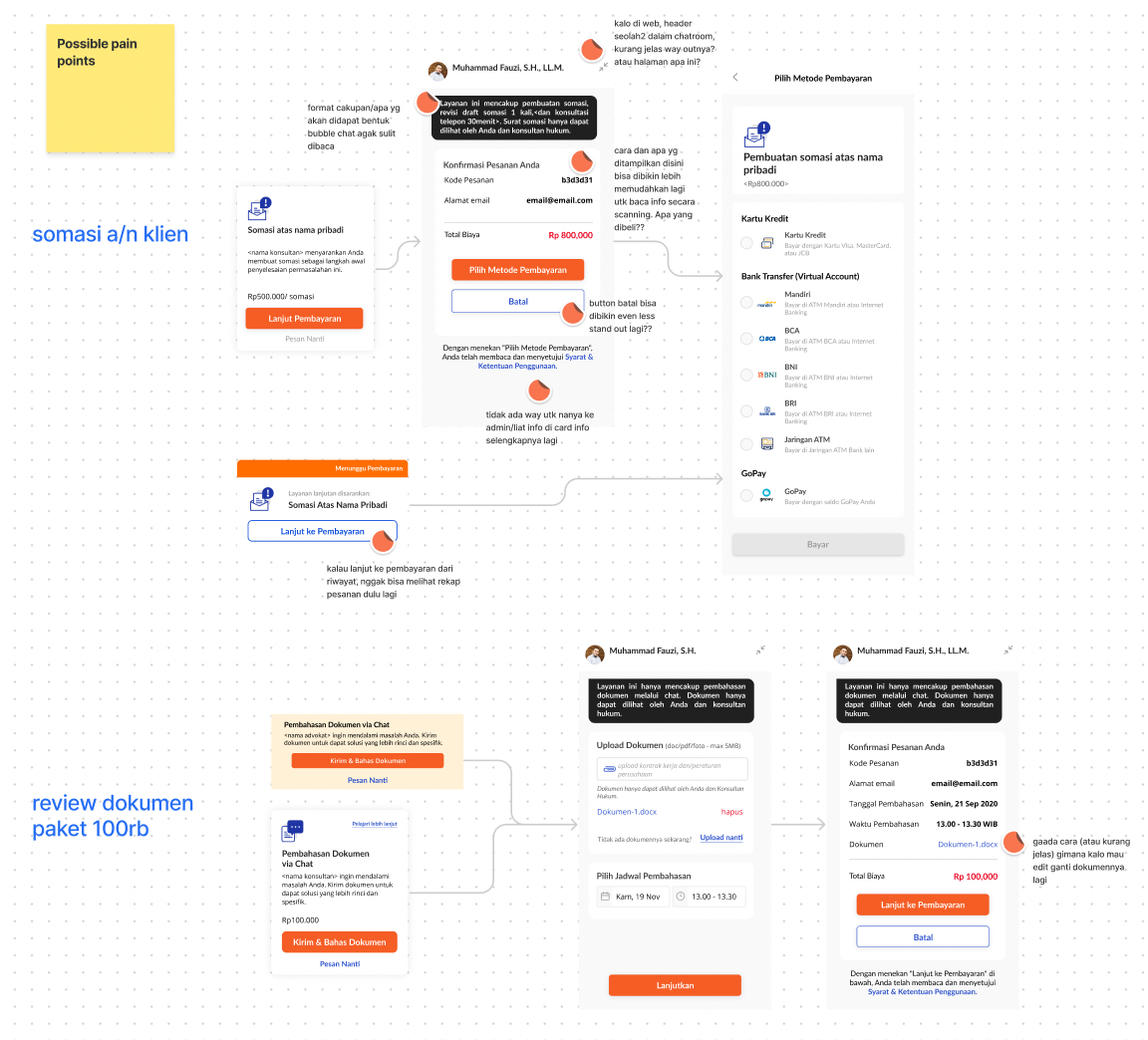
Our existing design used a chatroom-like UI for the upsell service checkout flow, a completely different approach from common checkouts that throws users off.
Not only that, but poor navigation on the page makes it difficult for users to update their order details, and there is no access to Justika’s customer support.
Information drives decisions.
The poorly designed page made it difficult for users to find and understand the information they needed. Additionally, legal services/products in their nature are not the easiest thing to understand for a lot of people, so balancing giving clear information without overwhelming the users is a crucial thing to achieve when redesigning the page.
I conducted card sorting with users to find the right structure to present information on the page. Then, I used the insights to make initial concept sketches for the page.
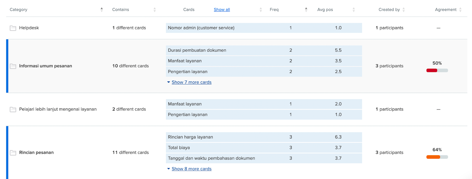
Synthesizing insights from card sorting research
A card sorting session with users helped us see how they make sense of the information given.
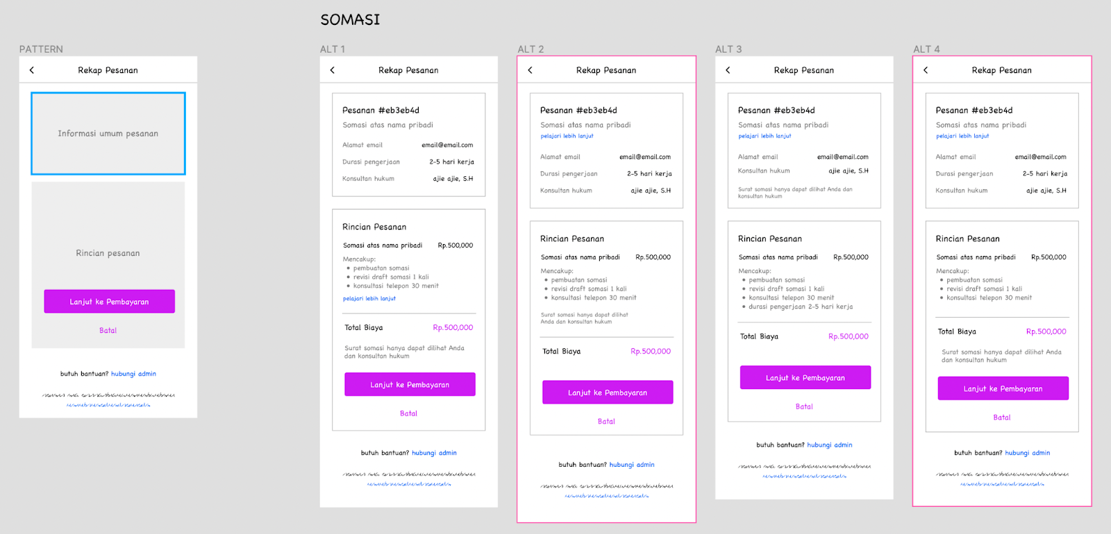
Concept sketching to try out different layouts quickly
From the insights we’ve gathered, I sketched multiple different layouts to quickly test which information architecture works best.
Lastly, I did a comparative analysis of different checkout pages with different complexities. This helped me map out opportunities that were relevant to us and created two design alternatives to be used for usability testing.
Putting all the puzzle pieces together
Through usability tests conducted with users comparing the two alternatives, we found that visual cues could help improve information comprehension. I used this finding, as well as insights from all the other research, to craft the final design.
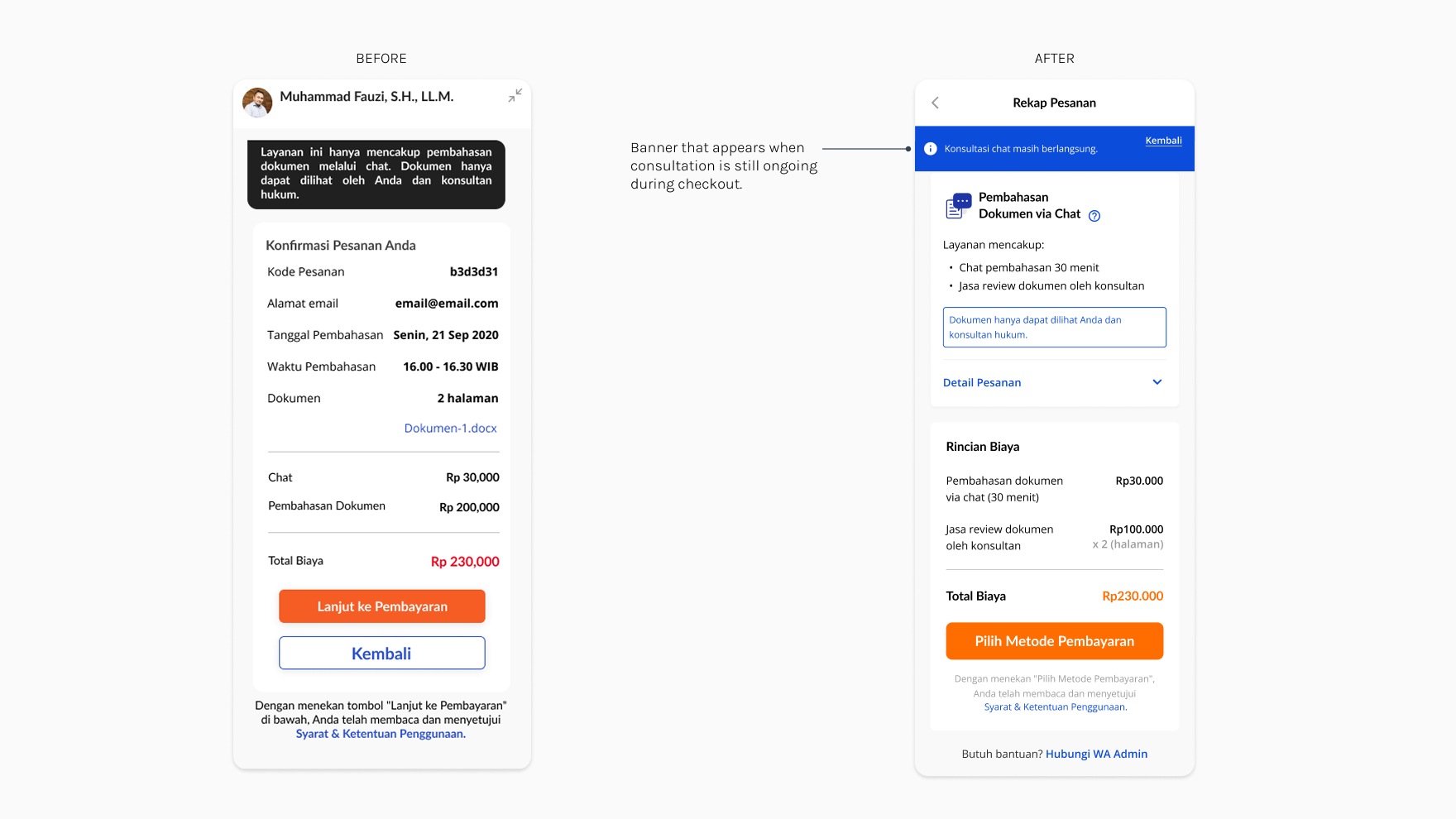
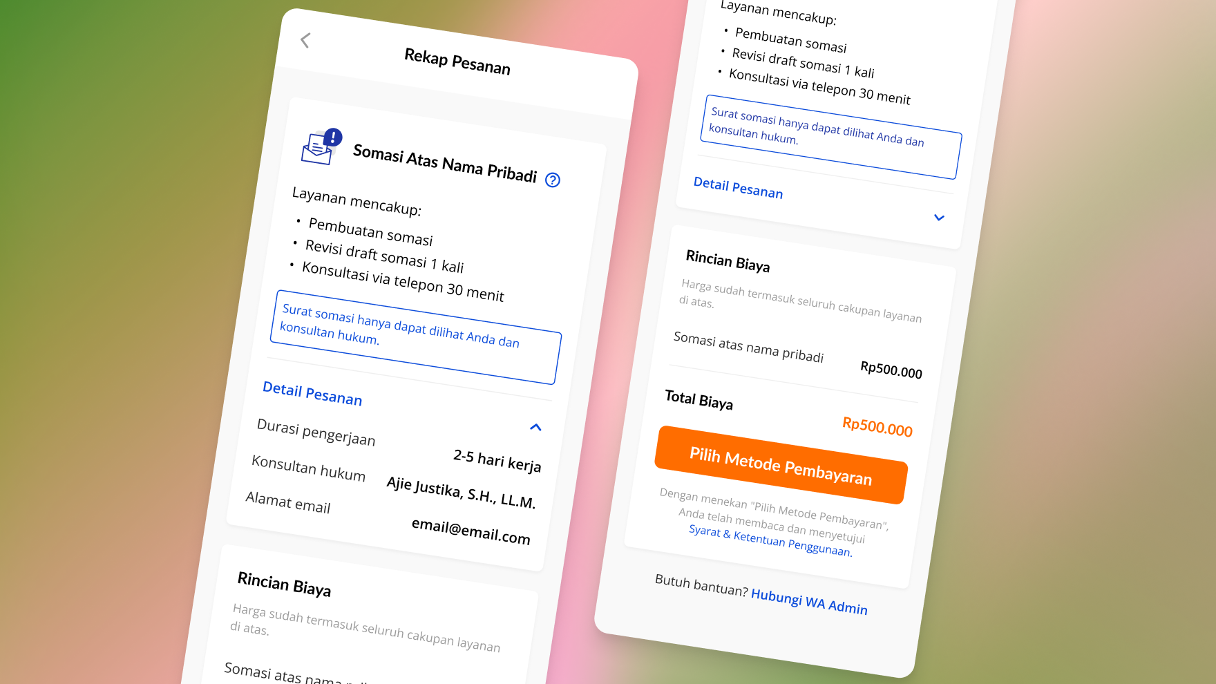
New look, recognizable patterns
The previous chatroom-like design made important information overlooked due to poor information architecture. New design leveraged best practices used in similar flows, giving familiarity and clarity.

Emphasizing the most important information for decision-making
Highlighting only the essential and crucial information needed to make a decision helped reduce users’ cognitive load.
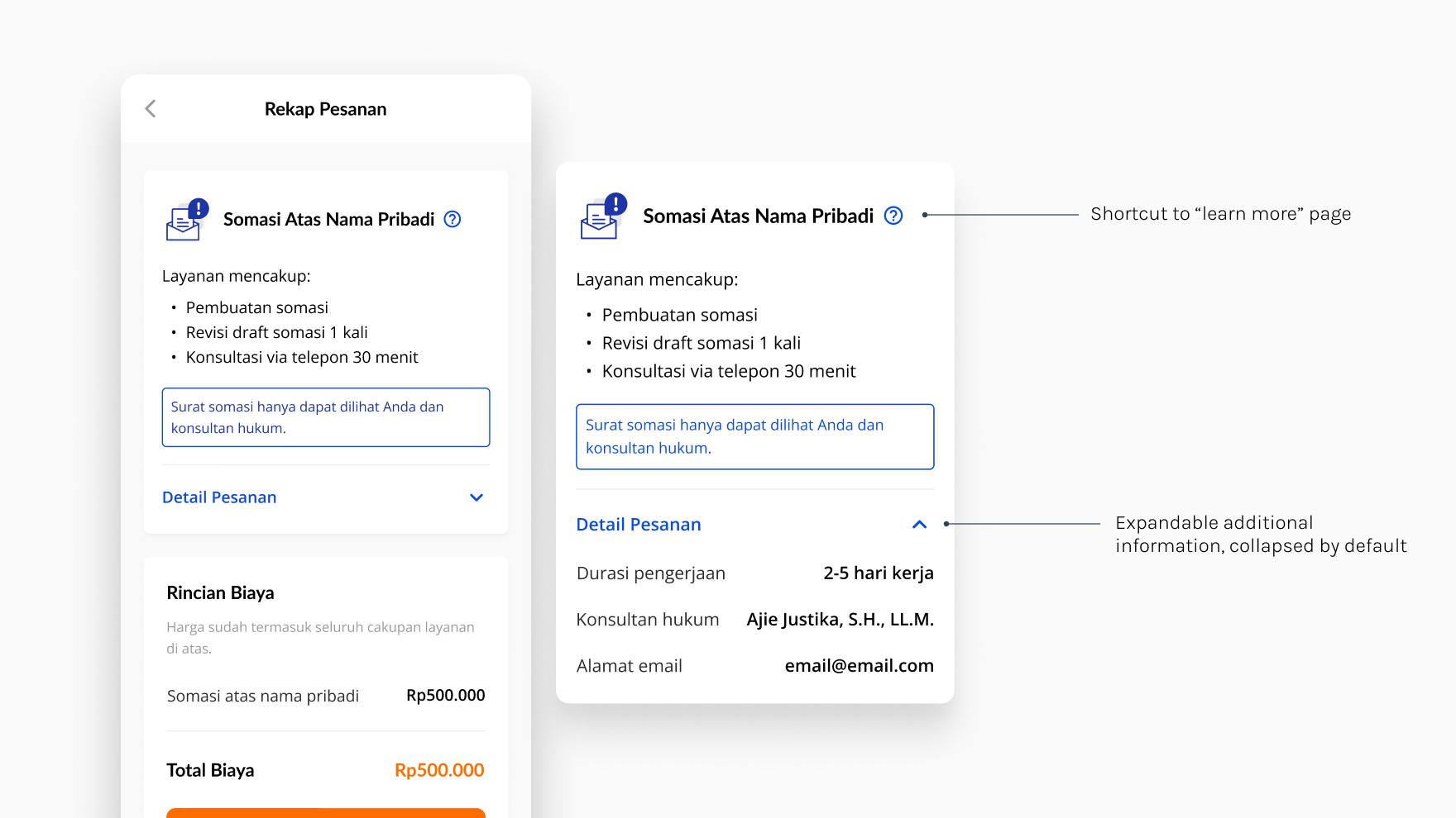
Easily access additional information, only if needed
Order details are easily expanded/collapsed as needed, making it less overwhelming. If users need additional information about the service, the “learn more” page and customer support number are easily accessible.
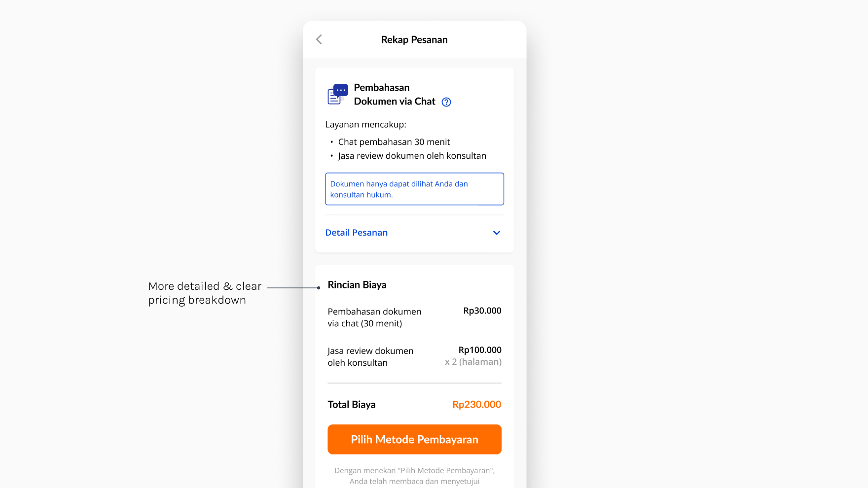
No fluff price details to increase trust
The price is detailed more clearly to build trust through transparency, since some users misinterpret the previous design to have unexpected fees.
In 10 days after the new design is released, the rate of users who proceed to checkout after being offered an upsell service in consultations increased by 27,5% in average across several different services.
In addition to that, the pattern I came up with in this redesign became the standard layout that is repeatedly used for other checkout flows/order summary pages present in the product across squads.
