Justika's Checkout Page: Redesigning Checkout Pages For Online Legal Services
Project Overview
Justika is a legal-tech company that makes legal services simple and affordable through technology. As legal services marketplace, Justika provides a new way for lawyers to interact with the public, be it individuals or mid-businesses.
In this project, we focused on Justika’s online consultation service for individuals and its upsell services (follow-up service after consultation).
Goal
The main goal of this project is to improve a checkout page to be more clear, informative, and consistent to encourage users to proceed in purchasing the upsell service.
Target Users
Justika’s retail users from chat consultation who potentially needs upsell service.
My Role
Project PIC (as product designer) collaborating with PM, engineers, and other designers in the squad.
Timeline
September 2021
Process summary
.png)
The Problem
When a user who consulted with a lawyer via chat needs further service for their legal case, such as document review or legal memo, they’re able to purchase these services directly from Justika’s web/app.
From previous data, we’ve seen that out of all steps to purchase an upsell service, users drop the most on the current checkout page – a step away from choosing payment method.
We assumed that this might be due to unclear information about what the user will get after paying – such as the scope of the service, as well as the way the existing information are presented. In addition, the checkout page for each upsell type had a different pattern, thus leading to confusion because of inconsistency.
Starting from those assumptions, we tried to dig deeper into the problem by finding out: How does a checkout page affect the conversion of a retail client who is offered an upsell service?
Initial Research
To uncover motivations and frictions in checking out an upsell service, we interviewed 6 users using the existing checkout page.
3 of the users were client who previously have been offered an upsell service, while the other 3 are those whose never seen the checkout page before. This was done in hopes of eliminating biases from users who might be familiar with the page.
The interview was done in a way that a usability test would, using the existing design, to figure out patterns of the user behavior and possible pain points from existing checkout process.
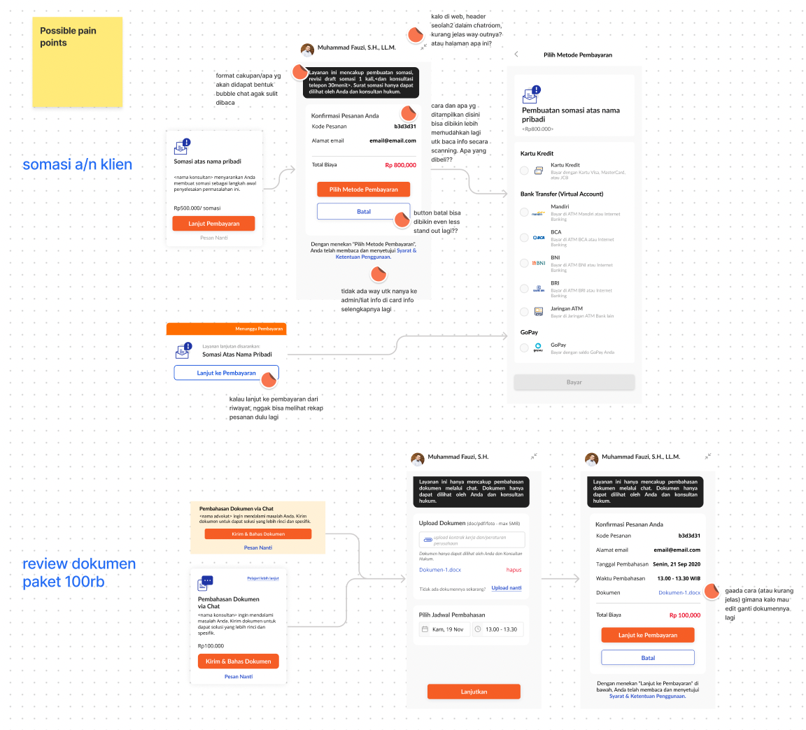
To support findings from the interview, I additionally made a task analysis from the existing design and talked with the Ops Team to learn about complaints/questions sent to customer support related to upsell service.
Identifying Pain Points
From the initial research, we mapped out factors that affect user’s decision to proceed to checkout, and identified the frictions that prevents them from doing so.
Some of the main pain points we uncover are:
- The checkout page that resembles a chatroom does not make it easy for users to understand information regarding their order.
- Detailed information on the scope of the service is not conveyed properly to the users due to unfamiliar layout and unclear/incomplete information. Some important information were missed by the user.
- Poor navigation on the page makes it difficult for users to change something about their order, such as changing review schedule or document file.
- There were no access to Justika’s customer support from the page, so when users have a question they either go back to ask the lawyer or explore other pages in the web, easily resulting in them getting lost.
The Solution
Crafting Information Structure
One of the challenges in redesigning the checkout page is the many amount of information needed to be included, since each information have a role in the user’s decision making. If not careful, the page could easily be overly complex.
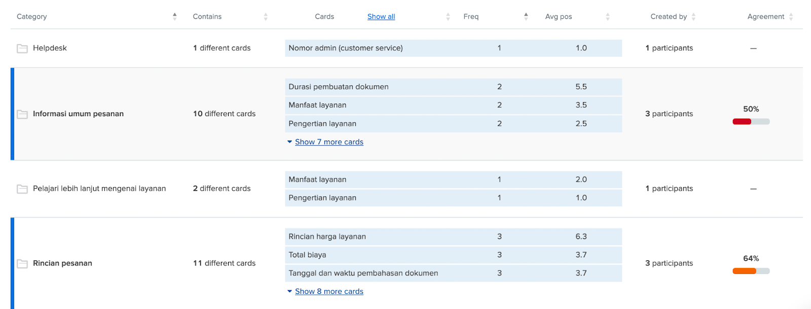
After listing down information needed in the page, I map their importance and conducted card sorting with users to help see how they make sense of the information.
This helps us find the right structure to present information on the page. From the data gathered here, I started to make initial concept sketches for the page.
Concept Sketching
After creating concept sketches, I held a design review with the squad to gather feedback especially on the information hierarchy, as well as understanding engineer’s side of information structure that might affect the designs.
At this point, I also facilitated discussions with the team to align which learning points to track and how it would relate to our goal.
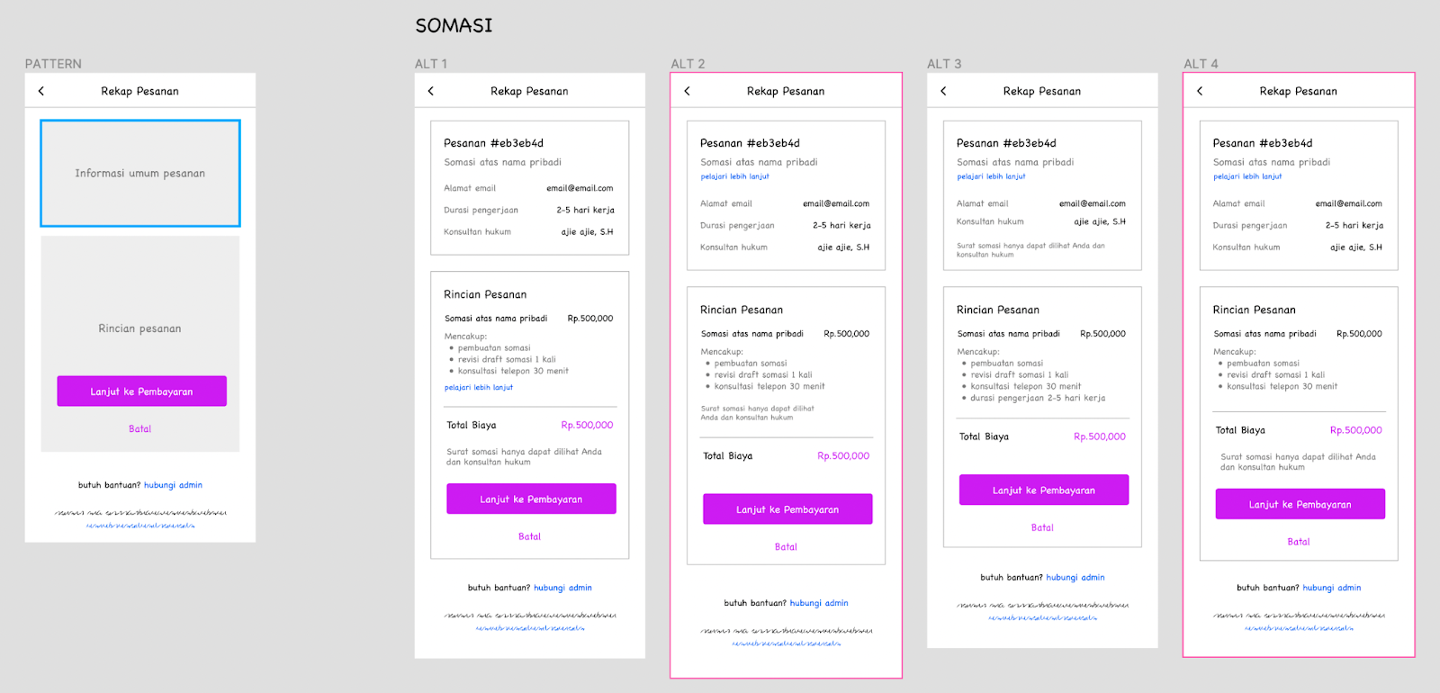
UI Design & Usability Test
In order to make the right information architecture for the page, I did a comparative analysis on different checkout pages with different complexities. From this, I mapped out opportunities that were relevant to us and created two design alternatives to be used for testing.
Through usability test conducted with users comparing the two alternatives, we found out that visual cues could help information comprehension for users while making decisions and crafted the final design.
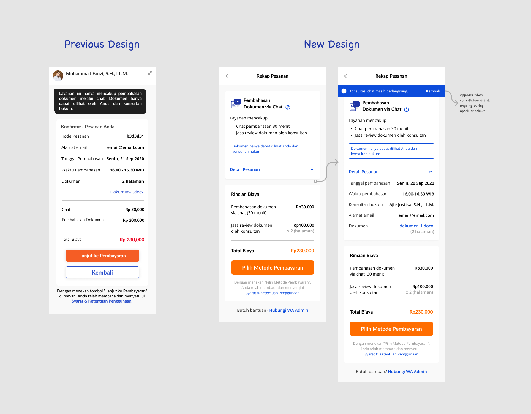
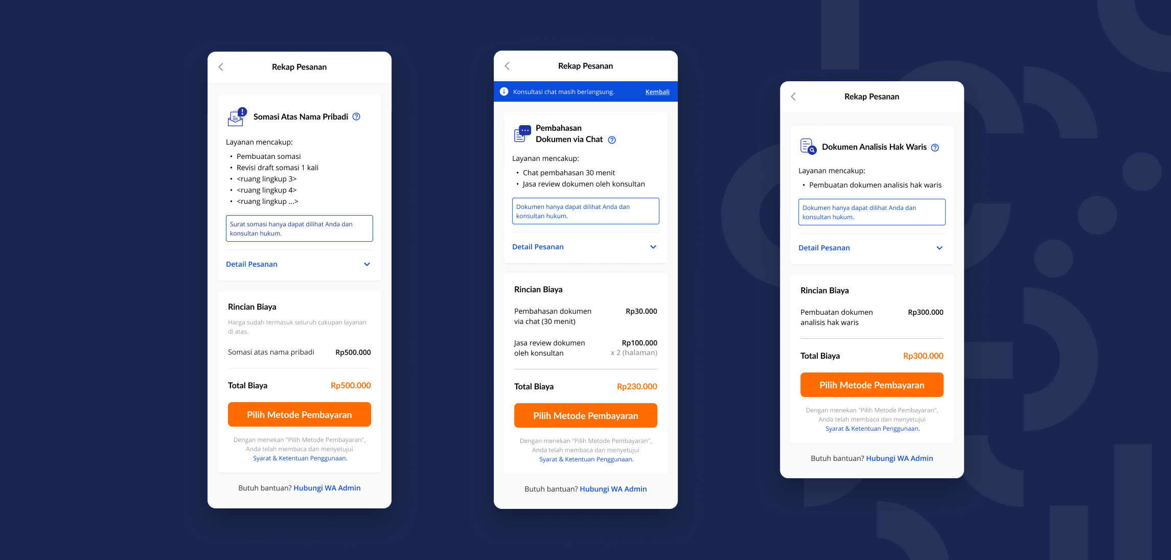
Here are some of the highlights from the final design:
- Information regarding service scope is emphasized better, since this is the information that users look for first on the page but were missed on the previous design due to poor readability and proximity.
- Order details are easily expanded/collapsed as needed, making it less overwhelming. If users need additional information about the service, the “learn more” page and customer support number are easily accesible.
- The price is detailed more clearly to build trust through transparency, since some users misinterpret the previous design to have unexpected fees.
The Outcome
10 days after the new design is released, the rate of users who proceeds to checkout increased by 27,5% in average across several upsell services.
In addition to that, the pattern used in this redesign became the pattern that is repeatedly used for other checkout or “order recap” pages present in the product for retail users.
Reflection
This project really helps strengthen my ability to explore different solution alternatives and digging deeper on each design. It also made me realize that sometimes, we have to take a step back and look away from the idea for a while to be able to come back with fresher mind. Looking back, I noticed how the initial concept sketches were so different compared to the final design — and how much better the final design was, thanks to the time taken to reflect on the design explorations.
I’ve also known that design consistency is essential, but this project reinforced to me how inconsistency in design really can affect user’s decision making. With that in mind though, I learned how to strike balance between keeping consistency and giving enough room to be flexible, in order to achieve the right solution. For instance, in this project I decided to use a component that we didn’t have in the design system before, such as expandable cards. It is important to communicate this to our peers to have the same understanding. In this project, thorough discussions with engineers (on why an extra effort to create this new component is needed) helped us gain new perspective to make richer decisions.
